plumrose


Saturday, 24 March 2012

Quilling- Hearts for Anniversary

For Mom and Dad, Happy 49th Anniversary.

For some stunning quilling cards, go have a peek at Neli's blog....my goodness what fabulous work. Recently I've given quilling a go, and Neli has given me some great inspiration.

So here's my latest: more practicing needed!


Wednesday, 21 March 2012

Heating Acetate


Wendy Vecchi has a product called Clearly For Art. 3 different colors to play with. I haven't got any yet, but loved how you can heat the stuff, form it while it's hot, and in 10secs it cools into shape. And it's solid. But, if you don't like the way it turned out, heat it up again and it flattens right back out. Too stickin cool.
You can see her demo it here . Her blog for another use of it is here:

Aaaaannyways, I couldn't wait to try out the technique. So I tried it with plain ole acetate that I had kept from a Texture Trade package. Cut out a Tathered Floral die from it and gave it a go.

First of all, it seems I missed a step Wendy says in her tut. I forgot to add the blending solution onto the applicator pad along with the Alcohol inks. But it seems to have worked out anyways. 


Firstly I covered all the cut outs with Glue and Seal Matt. Let it get good and dry. Then I used a blue color and a metallic silver AI's and just pounced over and over until I liked the look. The next step was to take the heat gun to it and when it's good and heated (watch those fingers) I just bend/mold the petals to shape. In a few seconds it's rock solid. All three pieces are held together with a little brad. Quicker and easier than glueing all three oddly shaped pieces. Then it was just a matter of finding a center piece.

So even tho using acetate seemed to work like Wendy's Clearly for Art....it was a slightly smelly when I heated it, so I had to wonder if I was breathing in toxins. So just be aware of that and don't stand over the piece and breath in, if you're too anxious to try it out with acetate.

The fancy square die cuts are from Nestabilities

Monday, 19 March 2012

Made me laugh


bahahaha! <3 

Don't yea just love a man who stands behind his artist! Imagine...a receipt that has a list of Tim Holtz's name on it over and over! What he must think then? LOL.    

Saw this on Pineterest

Saturday, 17 March 2012

Alcohol Ink and 25

My girlfriend has worked hard and lost 25lbs. And since a bottle of wine and a box of chocolates not the way to go, I opted to make her a little achievement tag.


I used 2 colors of alcohol inks, watered down a bit to make a puddle on my craft mat. Then wiped blue cardstock thru it. I also used the AI's on the daisy flower under the rose. I die cut a scrap piece of acetate then inked it up with various colors. (the acetate was previously coated with Glue and Seal matt. Stamped it up with various background stamps. The 25 is from an embossing folder using a dollor shop piece of metalic paper. Then just cut out the 25...I think it's the bingo folder. The butterfly is a Hero Arts stamp and die set....see previous posts for a link.

Friday, 16 March 2012

Nesting Doves

Today I finally had a chance to take a photo of the nest on my balcony. This is the second year the Doves have come back to lay their eggs. Not much of a nest, but aren't they pretty? For the past 4 years Robins have used the same wall planter to nest in. One of them came back this year and puffed up his feathers trying to intimidate the Doves. The Doves won out. But, like last year, the Robins came back after the Doves where all done and had flown off. So, I await to see what happens this year.


Monday, 12 March 2012

Alcohol Ink and Glossy Accents card

I'm playing with my alcohol inks today. It's on almost everything. I make my own application pads to apply the inks and therefore are somewhat thicker pads than what you buy ready made. Today I didn't switch it out for a new one and it had gotten a bit crusty. Which affected the AL . To a nice effect I think.


I applied metalic silver AI to the punched trim on the bottom and then used 2 colors of AI to tone it down with the same color scheme.  It's dotty/blotchy because the pad is crusty and the ink doesn't spread out so much. Plus used a very light touch. Ontop is a coat of glossy accent crackle paint.

Also on the torn background paper, I simply swirled my applicator around in little circles and got this very fine, almost pen like swirls, again with a light touch. 

Behind the rolled roses, I punched out some regular old, heavy tin foil, and lightly AI'd that too....just to get a hint of color.


 The butterfly is a stamp and die set from Hero Arts. Painted with Pink liquid pearls in the middle of the body, as well as dotted for dimension with the same. Then a coat of glossy accents crackle ontop.


Challenge Simon Says Stamp = Anything Goes

Alcohol Ink experiment

Still playing with my Alcohol Inks, I wanted to use up what was laying on my mat. I had a scrap piece of paper that already had a glossy swirly design on it. Which I figured would resist the AI. And it did to a point. The textured paper behind it absorbed the AI but to some degree so did the glossy swirly design. I quickly wiped off a lot of the AI and in the end didn't turn out to bad. It's just background anyways, and so anything goes.....at least in my world.

So I added some AI blender to my dried up puddles of AI on my craft mat. Used my finger to get all the AI involved, then dragged the paper thru the puddle, over and over until it was covered. Then wiped the piece with a paper towel to remove the AI from the glossy design.


The butterfly is a Hero Arts stamp and die set, double cut, with one bottom layer embossed , the top layer dotted with liquid pearls and completely covered with Glossy Accents to give it that botton feel. The sentiment heat embossed with White .


Rolled roses down the sides all ontop of an embossed ATC card. Here you can see a bit of the glossy swirly designed paper shining thru.


Challenge: Simon Says Stamp = Anything Goes

Sunday, 26 February 2012

ATC's

Working on a couple ATC's this weekend, just for fun and to use up some stash...using some Sassy sayings that I saw at Ink Stains. More to come!


Friday, 24 February 2012

Vintage and Crackle Paint

Just a little ATC card I made up today.
Playing along at Simon Say Stamp Challenge: 3 papers


Sunday, 19 February 2012

Tag it!

Playing along with Simon Says Challenge of the week - Tag It!


What I've been doing

It was a snowy day Friday, so hunkered down and happily crafted away.
I thought I would just post the cards and if anyone wants a "how to" guide, please don't hestitate to ask. Any comments left go straight to my inbox, so, I assume, I can reply to your comment.


Playing along at Simon Says Stamp.... Anything Goes!


Thursday, 16 February 2012

The Good, and the Ugly

Wanna see my ugliest card ever? I didn't really have a plan when I started my sweathearts Valentine's card. I just went for it. And altho I love Tim Holtz seasonal papers, it didn't help. Usually if I don't like how a card is coming out, I just keep at it, scrumage thru my stash and usually find something that can save it. But nothing could save this catastrophy. I absolutely hate how this came out. Yuk yuk yuk.


 Actually while working on my ugly card, I had intended to try a new technique of distress crackle painting a deboss. See here. Tammy suggested how awesome it looked using the woodgrain folder.  I was so excitted to try it, I kept forgetting to ink and dry the paper first. I tried 5 different papers. Talk about Duhhhh! The crackle paint becomes a resist and so can't be inked afterwards. Well I ran out of crackle :(   It didn't go so well, and I ditched the idea and made the ugly card.....can't win this one. The whole thing made me wonder if I should just run out and get my DH a card from the store - yes, I actually concidered it!

 Luckily for me I had a brain storm the morning of Valentines Day. My DH's favourite Valentine's joke is : What did the lumberjack say to his sweetheart? Wooood you be my Valentine! So this suggestion to use distress crackle on the woodgrain was a great idea. I could use that with his fav joke.

So in the end, here's the card he received: I made my own ornie, used newspaper to cut individual letters for the sentiment. To be like a ransom note. Also used one of the 5 I had forgotten to ink up, a different embossing folder for the frame, and a Nestibilities die for the heart wreath. Wheeewwww, Finally!

Fan of Tim Holtz and Simon Says Stamp


That's it for today....lots to clean up at the craft table!
Challenge: Studio L3 - Grungy Monday


Monday, 13 February 2012

For the Bride - Dress

Happy Monday...how's you're mojo today?

Well I spent the weekend working on an order for a Bridle Shower Card. I was almost done when I saw this layout on the internet. I was googling sentiments for the front and inside of the card, but just had to make this one, and leave the other one for another time. I just loved the idea of a white dress. I'm a little worried about how slim this one turned out....hopefully it doesn't set of any body image issues for the bride.  The one on the internet was quite wide and flowing. We'll see what the Mother thinks when she receives it. At least I have a backup! :)
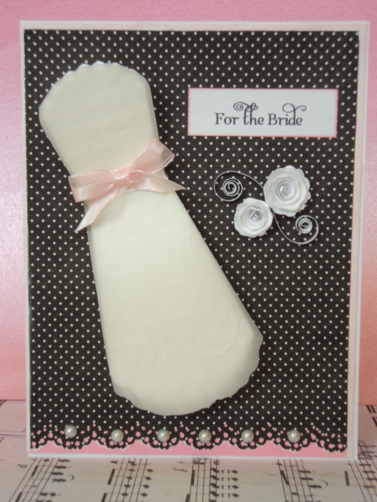
So, the top and bottom of the dress are two different sized scalloped oval shaped cutouts (cricut cut). I bet the round shaped one would make it bigger as I had seen. Then cut off the sides to form a shaped dress. As well, there are several layers to both halves. 4 on the bottom 3 at the top. No particular reason for the numbers, it's just how many actually cut nicely enough to use, so that's what I used. Just to give it some depth and mimic an actual bridal dress. I also ran all the pieces thru the cuttlebug with a folder that had some leafy and heart shapes to give them some design. Then ontop of both halves, I cut out some vellum and glued ontop with some Glossy Accents (so the glue doesn't show thru)
Added a pink ribbon, a few half pearls, some rolled roses and a quilled -swirly accent. The sentiment is computer generated using my latest font -Albemerle Swash.


Here's the one I had almost done...sentiment needed. The bride and grooms colors are black and white!


Sunday, 12 February 2012

Valentine - Be Mine

Yes, love is in the air and only 2 days away.


Saturday, 11 February 2012

Valentine - Distress Crackle Paint

Waaaay back when Tim Holtz was doing his 12 days of Tags, Tammy Tutterow came up with this technique that I just had to try. You can find her instructions here . So I started with masking the cupid and the heart onto beige cardstock. I used a variety of distress inks: Lipstick, festive berries, Olive, and some Millstone. Once dry, I ran it thru the cuttlebug with a heartsy folder. Then tried the new technique from above.
For the flower I tried using several layers of tissue paper with Tim's Mini Rosette die. It was a little challenging getting it into position as it's not sturdy like cardstock. But it worked out. It's centered on some of Tim's precut grungepaper- wings, and inked with DI Olive

The pink heart lace is from Nestabilities all ontop of some designer paper for the  background....already with script and the word 'memories'.

With this card, the paper is loose and frayed at the edges, corners curled.


If you can make it out. you can see how most of the crackle paint is in the de-bossed areas. I love the effect. 


Challenges:

Simon Say Stamp - Recipe  and  Love is in the Air 
 
Studio L3 - A Holtzian ATC

Saturday, 21 January 2012

Simply Round

Happy Weekend!

Today I'm trying out my new Nestabilities die. It comes with lots of heart circles. Truly a nice die. Unfortunately the package didn't tell me I needed a Tan Embossing mat in order to complete the embossing on these circles, so I can't utilize this die as much as it's capable. Isn't it maddening when the package doesn't tell you on the outside, what other tools you need?


These roses where rolled with good old, pink, card stock, cut into strips. Too thick to stuff into an envelope, so I'll have to adjust that for next time. Martha Stewart punch for the black and pinks leaves, and pen embossed to add some detail. Viva Pen for the pearl dots and a beautiful black and white ribbon . And of course some design paper for the background.


This butterfly is from my newest die and stamp set (see previous posts for link). It's heat embossed with black powder, painted using Lipstick Distress inks, and glittered with Diamond Stickles. And Liquid pearls make up the body.

Friday, 20 January 2012

Dotted Wishes

Everything about this card is dotted...embossed background,  flower centers are dotted with liquid pearls, the Butterfly is dotted with a Viva Pearl Pen, and then I used some pink sticky pearls here and there. The 'Wishes for You' sentiment is a trail and error with some brush markers...need to go a little heavier with them, but they're great to use and assortment of colors on your stamp.

Wednesday, 18 January 2012

Mother Knows Best - Tag

I'm still twirling! :)
This time I used my own acrylic paint to dab onto a background. The tag is a piece of brown cardstock, the paint color - Creamcoats"Cricket Grillon". It's almost a neony type color. The brown paper kind of soaked it up and ate up some of its vibrance. But then I added some Distress Crackle paint here and there, and it brought back all that vibrance. Who knew I'd get a cracked look and the color back too? The rest of the embellishments are the same rolled roses and die rosettes from my previous umpteen posts ;) They're just too easy to make, that I don't think I'll ever run out of them!


Sunday, 15 January 2012

3 postcards

These 3 were made on top of some craft paper that I was just playing around with, experimenting with pulling the paper thru puddles of various colors of inks and alcohol inks. The brown one was passed thru so many, many colors in an attempt to save all the efforts into it. The alcohol inks don't flow as nice as the distress inks. I like the way it worked with the blue inks and the metallic silver  alcohol inks, but the brown argggg! But in the end, after using them anyways, they didn't turn out half bad. The photos of them tho....another argggg. Capturing the true colors is a challenge. The metallic gold running thru the brown one really isn't so predominant in person. Maybe it's because it's metallic, the camera highlights it somewhat and drowns out the other techniques.

Anyways, here they are.